


Flip cards are a dynamic and engaging method to show content on a website. Flip cards are made with two sides: the front and the back. Users can flip the card to expose more information with a click or mouse hover. This article will show you how to easily build flip cards in React.
Session Replay for Developers
Uncover frustrations, understand bugs and fix slowdowns like never before with OpenReplay — an open-source session replay suite for developers. It can be self-hosted in minutes, giving you complete control over your customer data.

Happy debugging! Try using OpenReplay today.
Why are flip cards valuable additions to your websites:
- Flip cards can add an interactive and engaging element to your website's user interface.
- Flip cards capture users' attention and provide a visually appealing experience.
- Flip cards showcase a range of content, such as images, text, and links, in a small and simple format.
This interactive design component is commonly used for product showcases, information panels, portfolio highlights, interactive quizzes, and games.
To implement the flip cards, we will use the React-Card-Flip library. In this tutorial, we'll walk through the process of creating dynamic card components that flip when interacted with.
What is React-Card-flip?
React-Card-Flip is a small and easy-to-use library that helps developers create animated flip cards in React applications. With React-Card-Flip, you can concentrate on developing and arranging your card content while it handles the flip animations for you.
Below are some of the key features of React-Card-Flip:
Customizable: While the library includes a default flip animation, you can also change the flip animation and behavior of your cards to meet your specific requirements. You can change the animation speed, transition effects, and the order in which the card's sides are rendered.
Simple API: React-Card-Flip provides a straightforward and intuitive API, making it accessible to developers at various skill levels. This makes it easy to create flip cards with very little code.
Lightweight: This means that the library will not slow down your app, even if you have too many flip cards on your screen
Installation and Setup
To start, open your terminal and navigate to your project's directory. Run the following command to install React-Card-Flip.
// NPM
npm install --save react-card-flip

// YARN
yarn add react-card-flip
Once the packages are installed, import React-card-flip into the React component where you want to create the flip cards.
import ReactCardFlip from 'react-card-flip';
At this point, you've set up your React project and imported the React-Card-Flip library.
Creating a Simple Flip Card
With a few lines of code, we will implement a simple flip card in this section. In your already created file for your flip card, copy and paste the following code:
import React, { useState } from "react";
import ReactCardFlip from "react-card-flip";
const FlipCard = () => {
const [isFlipped, setIsFlipped] = useState(false);
const handleClick = () => {
setIsFlipped(!isFlipped);
};
return (
<ReactCardFlip
isFlipped={isFlipped}
flipDirection="vertical"
>
<div className="front">
<h1>This is the front card</h1>
<button onClick={handleClick}>Flip</button>
</div>
<div className="back">
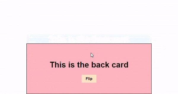
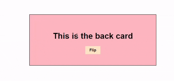
<h1>This is the back card</h1>
<button onClick={handleClick}>Flip</button>
</div>
</ReactCardFlip>
);
};
export default FlipCard;
In the above code, we’ve used simple div elements to wrap the front and back faces of the card. The button on both faces toggles the isFlipped state; when the user clicks, the card flips. The flipDirection is to determine the direction of the card flip. The isFlipped and flipDirection are among the React-Card-Flip properties.
Styling Flip Cards
Now that you’ve implemented a flip card in its most basic form, let's add some CSS in the App.css to style it. Copy and paste the following lines of code:
.App {
  font-family: sans-serif;
  text-align: center;
}
.front {
  border: 1px solid black;
  height: 200px;
  width: 500px;
  margin-left: 400px;
  margin-top: 100px;
  display: flex;
  flex-direction: column;
  justify-content: center;
  align-items: center;
  background-color: aliceblue;
}
.back {
  border: 1px solid black;
  height: 200px;
  width: 500px;
  margin-left: 400px;
  margin-top: 100px;
  display: flex;
  flex-direction: column;
  justify-content: center;
  align-items: center;
  background-color: lightpink;
}
button {
  border: none;
  background-color:bisque;
  width: 60px;
  height: 32px;
  font-size: 15px;
  font-weight: 600;
}
Here's the output of the simple flip card:
Adding Interactivity
To add a layer of engagement to your user interface, we will create flip cards that respond to user interactions, such as clicks or hover events. We’ve implemented the click event; let’s explore hover events. Include this code in the FlipCard.js file:
import React, { useState } from "react";
import ReactCardFlip from "react-card-flip";
const FlipCard = () => {
const [isFlipped, setIsFlipped] = useState(false);
const handleMouseEnter = () => {
setIsFlipped(true);
};
const handleMouseLeave = () => {
setIsFlipped(false);
};
return (
<div className="flip-card-container">
<ReactCardFlip isFlipped={isFlipped} flipDirection="vertical">
<div
className="front"
onMouseEnter={handleMouseEnter}
onMouseLeave={handleMouseLeave}
>
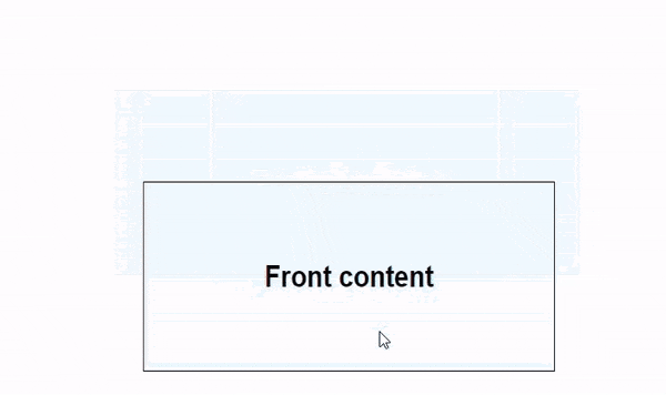
<h1> This is the front card </h1>
</div>
<div
className="back"
onMouseEnter={handleMouseEnter}
onMouseLeave={handleMouseLeave}
>
<h1> This is the back card </h1>
</div>
</ReactCardFlip>
</div>
);
};
export default FlipCard;
The code defines two event handlers: handleMouseEnter and handleMouseLeave. These event handlers are called when the mouse enters or leaves the card. The handleMouseEnter event handler sets the isFlipped variable to true, which flips the card. The handleMouseLeave event handler sets the isFlipped variable to false, which flips the card back.
Below is the outcome of the hover event.
Adding Animation
Let's add a bit of animation to further explore the possibilities of the React-Card-Flip library. Including animations in your flip cards can enhance the visual appeal and overall user experience. Here's an example of how to implement this:
import React, { useState } from "react";
import ReactCardFlip from "react-card-flip";

const FlipCard = () => {
  const [isFlipped, setIsFlipped] = useState(false);
  const handleClick = () => {
    setIsFlipped(!isFlipped);
  };

  return (
    <ReactCardFlip
      isFlipped={isFlipped}
      flipDirection="vertical"
      flipSpeedBackToFront={3}
      flipSpeedFrontToBack={3}
    >
      <div className="front">
        <h1>This is the front card</h1>
        <button onClick={handleClick}>Flip</button>
      </div>
      <div className="back">
        <h1>This is the back card</h1>
        <button onClick={handleClick}>Flip</button>
      </div>
    </ReactCardFlip>
  );
};

export default FlipCard;
In the above code, we implemented the flipSpeedBackToFront and the flipSpeedFrontToBack props of the library to regulate the speed of the card flip. The higher the number, the slower the flip animation.
Creating Complex Flip Cards
To further test the limits of this React Library, it's time to integrate them into real projects. We will implement a product showcase with flip cards. This will present a variety of information about the product by incorporating images, descriptions, and features.
import React, { useState } from "react";
import ReactCardFlip from "react-card-flip";
import "./styles.css";

const FlipCard = ({ imageUrl, name, description }) => {
  const [isFlipped, setIsFlipped] = useState(false);

  const handleClick = () => {
    setIsFlipped(!isFlipped);
  };

  return (
    <div className="car-card">
      <ReactCardFlip
        isFlipped={isFlipped}
        flipDirection="vertical"
      >
        {/* Front side */}
        <div
          className="card-front"
          onClick={handleClick}
        >
          <img
            src="https://i.ibb.co/b22kSx7/marek-pospisil-o-UBjd22g-F6w-unsplash.jpg"
            alt="orange"
          />
        </div>
        {/* Back side */}
        <div className="card-back" onClick={handleClick}>
          <h2>Orange Porsche</h2>
          <p>
            Lorem ipsum dolor sit amet, consectetur adipiscing elit, sed do
            eiusmod tempor incididunt ut labore et dolore magna aliqua. Ut enim
            ad minim veniam, quis nostrud exercitation ullamco laboris nisi ut
            aliquip ex ea commodo consequat. Duis aute irure dolor in
            reprehenderit in voluptate velit esse cillum dolore eu fugiat nulla
            pariatur.
          </p>
        </div>
      </ReactCardFlip>
    </div>
  );
};

export default FlipCard;
In this code, the card displays an image on the front and product details on the back. When the card is clicked, it flips to reveal the back side containing the product's name and description.
The isFlipped state and the handleCardClick function are used to control the flipping of the card. Clicking on either side of the card triggers the flip animation, revealing the other side. The next step is to style the card.
.app {
  text-align: center;
  padding: 20px;
}

.car-card {
  width: 300px;
  height: 200px;
  display: flex;
  align-items: center;
  justify-content: center;
  border-radius: 10px;
  cursor: pointer;
  overflow: hidden;
  transition: transform 0.5s;
}

.card-back {
  color: #333;
  text-align: center;
  background-color: #fff;
  border: 1px solid #ccc;
}

.car-card img {
  max-width: 100%;
  max-height: 100%;
}
This is what the outcome will look like:

Implementing Multiple Flip Cards
In this section, we will walk through creating multiple cards for our product showcase. This will help create real projects that display a collection of items, present various options, or showcase features and details.
Building the Flip Card Component
Before we delve into creating a showcase of multiple flip cards, let's start by constructing a reusable Flip Card component,FlipCard.js, which will serve as the foundation for each card in our product showcase.
import React, { useState } from "react";
import ReactCardFlip from "react-card-flip";
import "./styles.css";

const FlipCard = ({ imageUrl, name, description }) => {
  const [isFlipped, setIsFlipped] = useState(false);

  const handleClick = () => {
    setIsFlipped(!isFlipped);
  };

  return (
    <div className="car-card">
      <ReactCardFlip
        isFlipped={isFlipped}
        flipDirection="vertical"
      >
        {/* Front side */}
        <div
          className="card-front"
          onClick={handleClick}
          style={{
            cursor: "pointer",
          }}
        >
          <img
            src={imageUrl}
            alt={name}
          />
        </div>
        {/* Back side */}
        <div className="card-back" onClick={handleClick}>
          <h2>{name}</h2>
          <p>{description}</p>
        </div>
      </ReactCardFlip>
    </div>
  );
};

export default FlipCard;
Structure of the Multiple Flip Card Component
The MultipleFlipCards component, MultipleFlipCards.js, will serve as the container for our flip cards. We've prepared an array of cars, each containing its image, name, and description.
import React from "react";
import "./styles.css";
import FlipCard from "./flipCard";

const cars = [
  {
    imageUrl: "https://i.ibb.co/FXtFBSh/martin-katler-0-Sm-GWb-Zzw-unsplash.jpg",
    name: "Black Coupe",
    description: "Lorem ipsum dolor sit amet, consectetur adipiscing elit, sed do eiusmod tempor incididunt ut labore et dolore magna aliqua. Ut enim ad minim veniam, quis nostrud exercitation ullamco laboris nisi ut aliquip ex ea commodo consequat. Duis aute irure dolor in reprehenderit in voluptate velit esse cillum dolore eu fugiat nulla pariatur.",
  },
  {
    imageUrl: "https://i.ibb.co/7C3nkfr/niklas-du-EI1op-VNk4yg-unsplash.jpg",
    name: "Porsche",
    description: "Lorem ipsum dolor sit amet, consectetur adipiscing elit, sed do eiusmod tempor incididunt ut labore et dolore magna aliqua. Ut enim ad minim veniam, quis nostrud exercitation ullamco laboris nisi ut aliquip ex ea commodo consequat. Duis aute irure dolor in reprehenderit in voluptate velit esse cillum dolore eu fugiat nulla pariatur.",
  },
  {
    imageUrl: "https://i.ibb.co/b22kSx7/marek-pospisil-o-UBjd22g-F6w-unsplash.jpg",
    name: "Orange Lambogini",
    description: "Lorem ipsum dolor sit amet, consectetur adipiscing elit, sed do eiusmod tempor incididunt ut labore et dolore magna aliqua. Ut enim ad minim veniam, quis nostrud exercitation ullamco laboris nisi ut aliquip ex ea commodo consequat. Duis aute irure dolor in reprehenderit in voluptate velit esse cillum dolore eu fugiat nulla pariatur.",
  },
];

function MultipleFlipCards() {
  return (
    <div className="app">
      <h1>Our Cars</h1>
      <div className="car-container">
        {cars.map((car, index) => (
          <FlipCard
            key={index}
            imageUrl={car.imageUrl}
            name={car.name}
            description={car.description}
          />
        ))}
      </div>
    </div>
  );
}

export default MultipleFlipCards;
To bring life to our product showcase, copy and paste the following code:
.app {
  text-align: center;
  padding: 20px;
}
.car-container {
  display: flex;
  justify-content: center;
  flex-wrap: wrap;
  gap: 20px;
}
.car-card {
  width: 300px;
  height: 200px;
  display: flex;
  align-items: center;
  justify-content: center;
  border-radius: 10px;
  cursor: pointer;
  overflow: hidden;
  transition: transform 0.5s;
}
.card-back {
  color: #333;
  background-color: #fff;
  border: 1px solid #ccc;
}
.car-card img {
  max-width: 100%;
  max-height: 100%;
}
Here's what our final cars showcase will look like.

Conclusion
In this tutorial, we embarked on a journey to master the art of creating flip cards using the React-Card-Flip library. From the basics of installation and usage to advanced topics like interactivity, animations, and implementation of complex flip cards. You now possess the knowledge to craft impressive and engaging flip cards for your web applications.
As you continue experimenting with flip cards, consider pushing the boundaries of creativity. Explore combining flip cards with other UI elements by turning ordinary user interfaces into extraordinary experiences. Happy flipping!